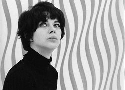
Bridget Riley was born in London, but also lived in Cornwall and Lincolnshire. She studied at Goldsmiths' College from 1949 to 1952, then the Royal College of Art between 1952 and 1955. She went from painting semi-impressionist figures to pointillism landscapes, then in 1960 her style evolved into the exploration of optical phenomena, or 'Op-art'. The pieces she created in this style aim to produce a disorientating physical effect on the eye.
Referenced from: http://www.tate.org.uk/art/artists/bridget-riley-1845
At Hornsey, Riley began her first Op Art paintings, working only in black and white and using simple geometric shapes - squares, lines and ovals. Although she investigated many areas od perception, her work, with its emphasis on optical effects was never intended to be an end in itself. It was instinctive, not based on theory but guided by what she saw with her own eyes. http://www.op-art.co.uk/bridget-riley/
 |
| 'Kiss' 1961 |
 |
| 'Movement in Squares' 1961 |
It was around [1965] that the term ‘Op Art’ entered the public consciousness. Op Art captured the imagination of the public and became part of the swinging sixties. The fashion, design and advertising industries fell in love with its graphic, sign-like patterns and decorative value. Op Art was cool, and Bridget Riley became Great Britain’s number one art celebrity.
The basis of the Op Art movement was a form of geometric abstraction, which was in a way impersonal and not obviously related to the real world.
“I couldn’t get near what I wanted through seeing, recognizing and recreating, so I stood the problem on its head. I started studying squares, rectangles, triangles and the sensations they give rise to… It is untrue that my work depends on any literary impulse or has any illustrative intention. The marks on the canvas are sole and essential agents in a series of relationships which form the structure of the painting.” (Bridget Riley)
http://www.op-art.co.uk/bridget-riley/
 |
| 'Pause' 1964 |
“The music of colour, that’s what I want” (Bridget Riley)
Riley’s introduction of colour to her work was something she was cautious of. The black and white paintings depended on the disruption of stable elements. No such stable basis could be found for colour as the perception of colour is relative – each colour affects and is affected by the colours next to it. Over time, she began to accept this inherent instability and made it the basis of her work.
From 1967 onwards Riley increasingly began to use colour. She also started to use more stabilised forms – often simple vertical straight or wavy lines. It was the positioning of the colour itself that produced the feel of movement she wanted to convey. The colour groupings affected the spaces between them to produce fleeting glimpses of other colours and hence the illusion of movement.
http://www.op-art.co.uk/bridget-riley/
 |
| 'Cataract 3' 1967 |
 |
| 'Zing 1' 1971 |
 |
| 'Hesitate' 1964 |
 |
| 'Arrest III' 1965 |
 |
| 'Untitled' 1961 |
 |
| 'Rise I' 1968 |
 |
| 'Crest' 1964 |
 |
| 'Fall' 1963 |
 |
| 'Around' 1963 |
 |
| 'Fugitive' 1962 |
 |
| 'Search' 1966 |
 |
| 'Blaze' 1964 |
Op, or Optical, art typically employs abstract patterns composed with a stark contrast of foreground and background - often in black and white for maximum contrast - to produce effects that confuse and excite the eye. Initially, Op shared the field with Kinetic art - Op artists being drawn to virtual movement, Kinetic artists attracted by the possibility of real motion. Both styles were launched with Le Mouvement, a group exhibition at Galerie Denise Rene in 1955. It attracted a wide international following, and after it was celebrated with a survey exhibition in 1965, The Responsive Eye, at the Museum of Modern Art in New York, it caught the public's imagination and led to a craze for Op designs in fashion and the media. To many, it seemed the perfect style for an age defined by the onward march of science, by advances in computing, aerospace, and television. But art critics were never so supportive of it, attacking its effects as gimmicks, and today it remains tainted by those dismissals.
- The Op art movement was driven by artists who were interested in investigating various perceptual effects. Some did so out of sheer enthusiasm for research and experiment, some with the distant hope that the effects they mastered might find a wide public and hence integrate modern art into society in new ways. Rather like the geometric art from which it had sprung, Op art seemed to supply a style that was highly appropriate to modern society.
- Although Op can be seen as the successor to geometric abstraction, its stress on illusion and perception suggests that it might also have older ancestors. It may descend from effects that were once popular with Old Masters, such as trompe l'oeil (French: "deceive the eye"). Or indeed from anamorphosis, the effect by which images are contorted so that objects are only fully recognizable when viewed from an oblique angle. Or, equally, Op may simply be a child of modern decoration.
- During its years of greatest success in the mid-1960s, the movement was sometimes said to encompass a wide range of artists whose interests in abstraction had little to do with perception. Some, such as Joseph Albers, who were often labeled as Op artists, dismissed it. Yet the fact that the label could seem to apply to so many artists demonstrates how important the nuances of vision have been throughout modern art.
- Long after Op art's demise, its reputation continues to hang in the balance. Some critics continue to characterize its designs as "retinal titillations." But others have recently argued that the style represented a kind of abstract Pop art, one which emulated the dazzle of consumer society but which refused, unlike Pop artists like Andy Warhol, to celebrate its icons.
Reference: http://www.theartstory.org/movement-op-art.htm
[Below] http://www.tate.org.uk/search?q=bridget+riley
I really like these prints, they're all untitled but come under various series of 'Fragments'. Some of the series' focus on straight lines and angles, where others feature curvy shapes. They're all screen printed onto perspex. I love the pattern and the boldness of the black on white. This is exactly what I'm looking for to fit with my concept! I can definitely picture a suit with some of these prints on! Not exactly what you'd see on Savile Row mind you...
 |
| 'Untitled' [Fragment 1/7] 1965 |
 |
| 'Untitled' [Fragment 2/10] 1965 |
 |
| 'Untitled' [Fragment 3/11] 1965 |
 |
| 'Untitled' [Fragment 4/6] 1965 |
 |
| 'Untitled' [Fragment 5/8] |
 |
| 'Untitled' [Fragment 6/9] |
 |
| 'Untitled' [Fragment 7/5] |
Some other Bridget Riley artworks from the Tate website:
 |
| 'Untitled' 1964 |
 |
| 'A' 1968 |
 |
| 'B' 1968 |
 |
| 'C' 1968 |
 |
| 'D' 1968 |